The Hipertipo icon
02 February 2021 hipertipo graphic
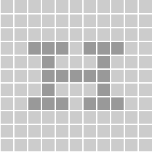
The Hipertipo icon ![]() was designed around 2004 as the favicon of our first website. I like it for its simplicity: a typographic uppercase H inside a square of 11×11 pixels. Echoing the shape of the serifs, a pair of Ts can also be seen in the central counters. The resulting shape sounds like the word it represents.
was designed around 2004 as the favicon of our first website. I like it for its simplicity: a typographic uppercase H inside a square of 11×11 pixels. Echoing the shape of the serifs, a pair of Ts can also be seen in the central counters. The resulting shape sounds like the word it represents.


The minimal geometry of the symbol communicates the essence of what Hipertipo set out to do from the start: lettershapes for low resolution screens.
The design can be used as a base for all kinds of typographic effects, adding extra layers of meaning without taking away the identity of the symbol.


More playful variations with different colors and backgrounds are also possible.


